ShopDreamUp AI ArtDreamUp
Deviation Actions


Suggested Deviants


Suggested Collections


![[Speedpaint] Meta Knight vs Galacta Knight](https://images-wixmp-ed30a86b8c4ca887773594c2.wixmp.com/f/c899de9b-28f5-4d53-9ce2-9a575dd3ff7e/d7rg09i-673f0c77-4340-48e9-b77b-41a2d07f5674.png/v1/crop/w_184,h_184,x_0,y_22,scl_0.15069615069615,q_70,strp/_speedpaint__meta_knight_vs_galacta_knight_by_assassinknight_47_d7rg09i-92s-2x.jpg?token=eyJ0eXAiOiJKV1QiLCJhbGciOiJIUzI1NiJ9.eyJzdWIiOiJ1cm46YXBwOjdlMGQxODg5ODIyNjQzNzNhNWYwZDQxNWVhMGQyNmUwIiwiaXNzIjoidXJuOmFwcDo3ZTBkMTg4OTgyMjY0MzczYTVmMGQ0MTVlYTBkMjZlMCIsIm9iaiI6W1t7InBhdGgiOiJcL2ZcL2M4OTlkZTliLTI4ZjUtNGQ1My05Y2UyLTlhNTc1ZGQzZmY3ZVwvZDdyZzA5aS02NzNmMGM3Ny00MzQwLTQ4ZTktYjc3Yi00MWEyZDA3ZjU2NzQucG5nIiwiaGVpZ2h0IjoiPD0xNTEzIiwid2lkdGgiOiI8PTEwMjQifV1dLCJhdWQiOlsidXJuOnNlcnZpY2U6aW1hZ2Uud2F0ZXJtYXJrIl0sIndtayI6eyJwYXRoIjoiXC93bVwvYzg5OWRlOWItMjhmNS00ZDUzLTljZTItOWE1NzVkZDNmZjdlXC9hc3Nhc3NpbmtuaWdodC00Ny00LnBuZyIsIm9wYWNpdHkiOjk1LCJwcm9wb3J0aW9ucyI6MC40NSwiZ3Jhdml0eSI6ImNlbnRlciJ9fQ.EM3ceVJDZ5J2G5ETs6VxqhA0iNtp9HUOLFD-LuoyYZg)
![[Speedpaint] Meta Knight vs Galacta Knight](https://images-wixmp-ed30a86b8c4ca887773594c2.wixmp.com/f/c899de9b-28f5-4d53-9ce2-9a575dd3ff7e/d7rg09i-673f0c77-4340-48e9-b77b-41a2d07f5674.png/v1/crop/w_92,h_92,x_0,y_11,scl_0.075348075348075,q_70,strp/_speedpaint__meta_knight_vs_galacta_knight_by_assassinknight_47_d7rg09i-92s.jpg?token=eyJ0eXAiOiJKV1QiLCJhbGciOiJIUzI1NiJ9.eyJzdWIiOiJ1cm46YXBwOjdlMGQxODg5ODIyNjQzNzNhNWYwZDQxNWVhMGQyNmUwIiwiaXNzIjoidXJuOmFwcDo3ZTBkMTg4OTgyMjY0MzczYTVmMGQ0MTVlYTBkMjZlMCIsIm9iaiI6W1t7InBhdGgiOiJcL2ZcL2M4OTlkZTliLTI4ZjUtNGQ1My05Y2UyLTlhNTc1ZGQzZmY3ZVwvZDdyZzA5aS02NzNmMGM3Ny00MzQwLTQ4ZTktYjc3Yi00MWEyZDA3ZjU2NzQucG5nIiwiaGVpZ2h0IjoiPD0xNTEzIiwid2lkdGgiOiI8PTEwMjQifV1dLCJhdWQiOlsidXJuOnNlcnZpY2U6aW1hZ2Uud2F0ZXJtYXJrIl0sIndtayI6eyJwYXRoIjoiXC93bVwvYzg5OWRlOWItMjhmNS00ZDUzLTljZTItOWE1NzVkZDNmZjdlXC9hc3Nhc3NpbmtuaWdodC00Ny00LnBuZyIsIm9wYWNpdHkiOjk1LCJwcm9wb3J0aW9ucyI6MC40NSwiZ3Jhdml0eSI6ImNlbnRlciJ9fQ.EM3ceVJDZ5J2G5ETs6VxqhA0iNtp9HUOLFD-LuoyYZg)


You Might Like…


Featured in Groups


Comments3
Join the community to add your comment. Already a deviant? Log In
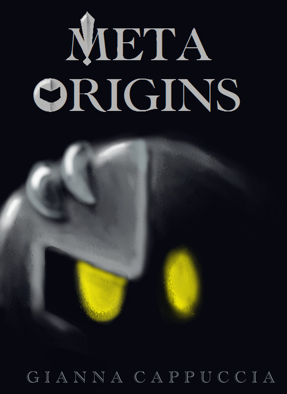
Very nice, clean cover for a story! I personally believe that clean and sleek covers suit a book better. Very professional fonts and placement for the title and your name that are not to difficult to read or something similar.
I love how MK's eyes glow and are the focus because they are the only things with color. I also like how everything is shrouded under the cover of darkness and especially since MK's past is unknown, it shows that directly in the cover. The split mask with half his face covered and the other half uncovered gives the feel that MK has something hidden behind his GSA status as a soldier and everything and that there's more to him than what may be seen.
I think the only thing that I can say against this at all is perhaps the eye shape. His right eye ( the one on the left) is a little wider than his left eye ( the one on the right) and his left eye is more oval than the other. I think the oval shaped eye looks a little better, but then again, were you perhaps showing his seriousness with the slightly wider eye that MK may have when he's the confident soldier and perhaps showing a little less sure of himself side with the other? If that's the case, maybe a more distinct line through the center would show this split.
Other than that, this cover is quite stunning and would definitely intrigue readers. Wonderful work! (Smile)")
I love how MK's eyes glow and are the focus because they are the only things with color. I also like how everything is shrouded under the cover of darkness and especially since MK's past is unknown, it shows that directly in the cover. The split mask with half his face covered and the other half uncovered gives the feel that MK has something hidden behind his GSA status as a soldier and everything and that there's more to him than what may be seen.
I think the only thing that I can say against this at all is perhaps the eye shape. His right eye ( the one on the left) is a little wider than his left eye ( the one on the right) and his left eye is more oval than the other. I think the oval shaped eye looks a little better, but then again, were you perhaps showing his seriousness with the slightly wider eye that MK may have when he's the confident soldier and perhaps showing a little less sure of himself side with the other? If that's the case, maybe a more distinct line through the center would show this split.
Other than that, this cover is quite stunning and would definitely intrigue readers. Wonderful work!